CEIF Logo
Create a welcoming and approachable brand system for an exciting new scientific and industry collaboration.
Background
CEIF is the first and only Industry/University collaborative research center for Insect Agriculture based in North America. The I/UCRC model provides a strong value for funds investing (around $40 in research value for every $1 invested), and utilizes a well-tested format to ensure agile response to Industry Member feedback.
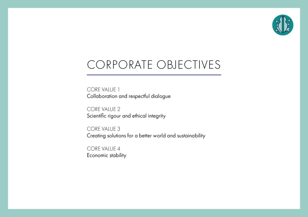
Finding Our Voice
After meeting and completing the intake questionnaire, we distilled the the project voice to 4 Core Values that would inform the overall logo look and feel:
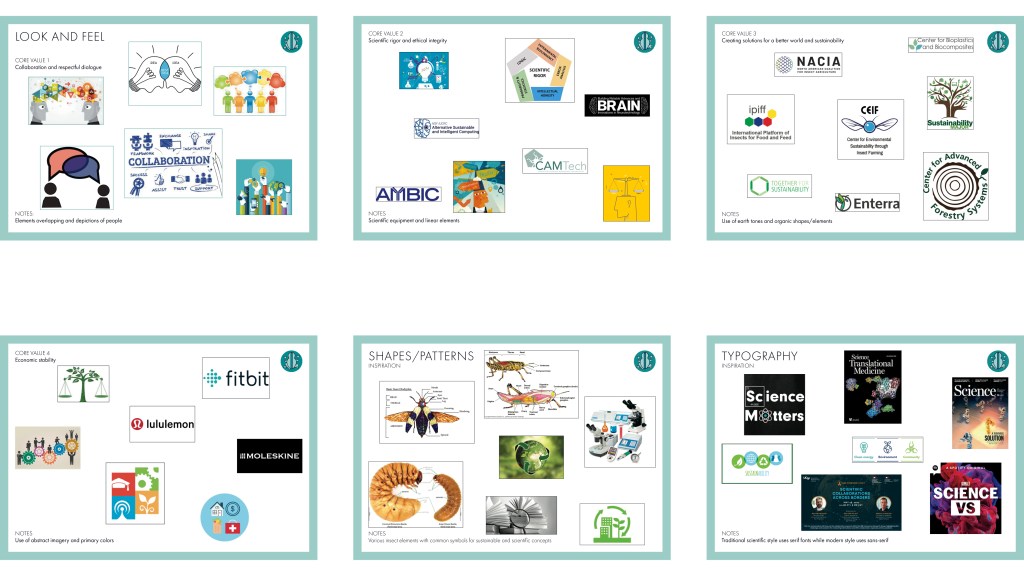
Drawing Inspiration
The team identified some important visual requirements and moodboards were created based on these requirements:
-The CEIF logo should telegraph “insect” though not any specific species
-The logo should be crisp and communicate “science” as well as “environmental sustainability”
-Do not use yellow
-No retro or classical feel
-No hand drawn or scripted feel
Final Logo
The final logo has several different elements that combine to create a friendly yet professional mark with pictorial and word mark components.
The logo itself can be broken into the pictorial and word mark components, giving CEIF a system of different branding option.
